We released the first stable version of plasma-nm today, but that was not the only thing I was working on during the last (3) months. I was working on my GSoC project and because GSoC almost ends I would like to show you my results. My GSoC project has two parts, the first part is network applet optimized for Plasma active and the second is active settings for configuring network connections.
Applet
The first idea was to have two versions of plasma-nm applet, one version for desktop and one for plasma active, but we had a session/discussion at the Akademy with Thomas and Bjorn and we came up with the perfect design which is suitable for both parties. No additional changes are needed to make the applet easily usable on Plasma active.
Some screenshots from Plasma active running on Nexus 7


Active settings
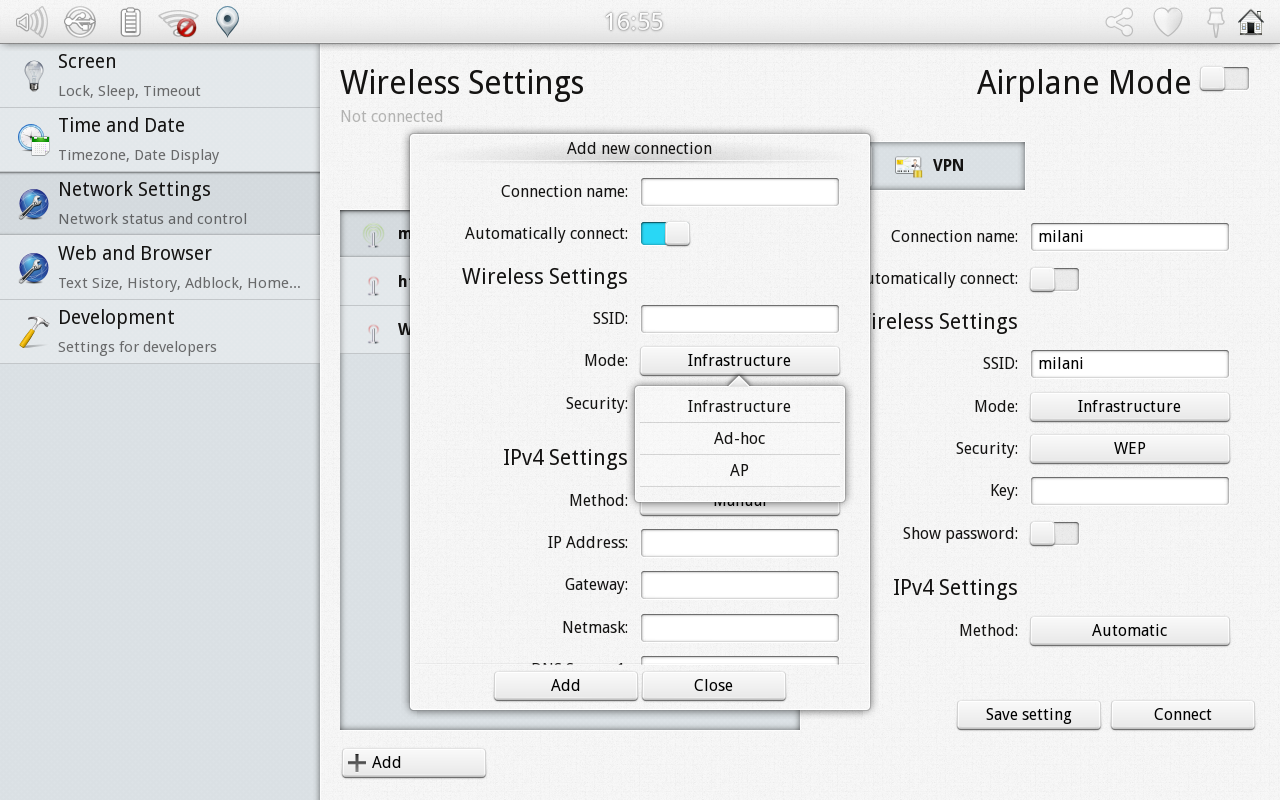
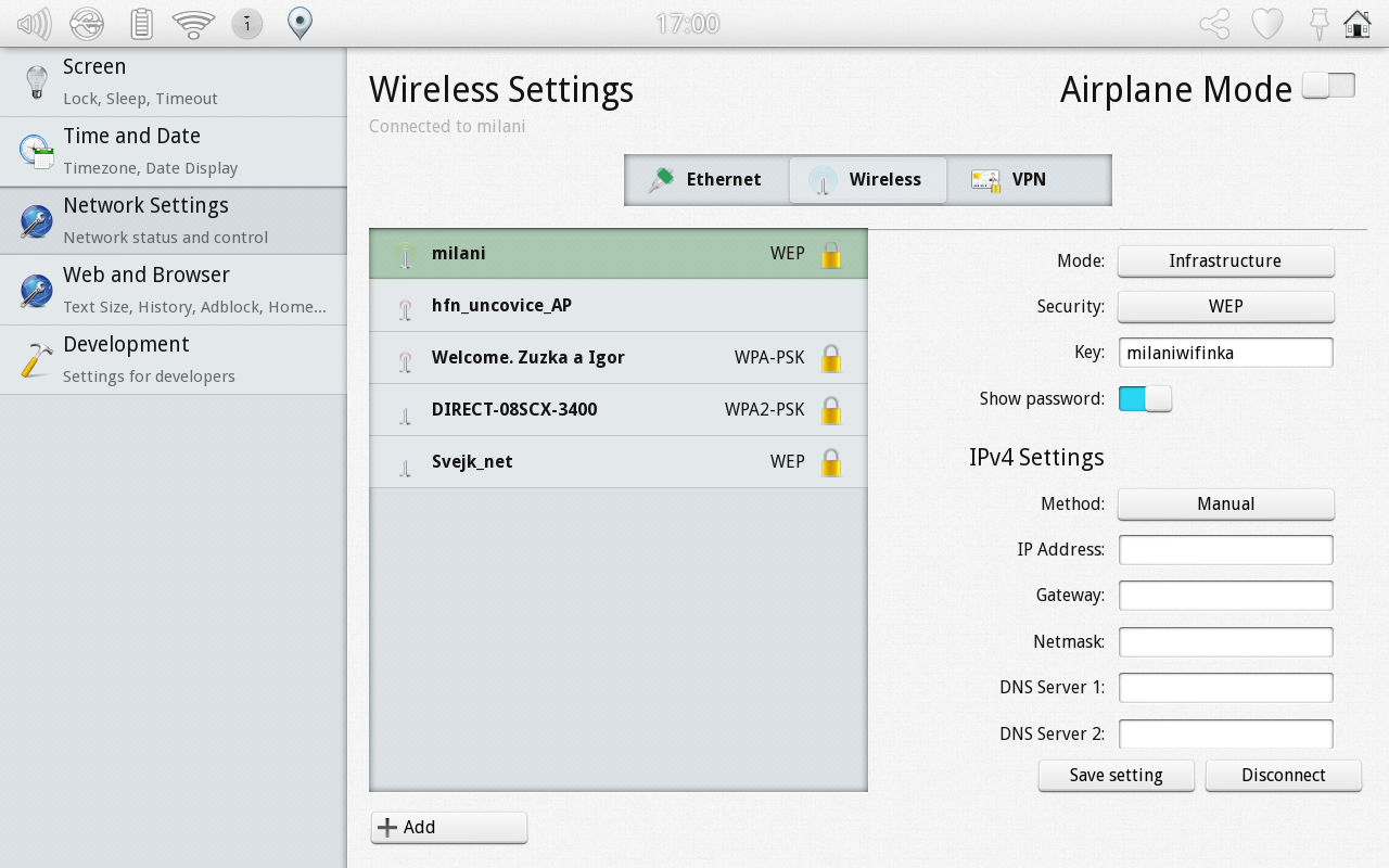
My focus in this GSoC was especially the network active settings, but it was much more difficult than I thought. So far I have fully functional wired, wireless (except WPA Enterprise) and (almost finished) GSM connections, which you can add or edit. VPN connections has no configuration yet and you can only connect/disconnect them. Since GSoC ends in a few days, I will focus now on bugfixing and small improvements and leave the rest (VPN and WPA2 Enterprise) after GSoC, because it is beyond my power to implement everything during GSoC period and those are the most complex and I think they are not so common on tablet devices.
Some screenshots
You can find it in plasma-nm git repository (http://quickgit.kde.org/?p=plasma-nm.git) under “active” branch.


Great job! Congratulations!
Indeed, great work! I’m looking forward to seeing it in action! And it looks like it should be ready for the next PA release.
Works so far so good here, a few minor things: it would be nice if the tooltip content (mouse hover on icon) could either be configured or if it would show the signal strenght for WiFi. Currently a lot of clicks are needed in order to see it.
In general there are quite a lot of clicks needed for many actions (such as connecting to a network). While this might make sense on a touch interface, it is quite a pain with the mouse. Maybe one of the KDE usability people could do a review on the plasmoid before it replaces the current one?
In general: great work, thanks a lot.
This design came up from from discussion with usability guys (Thomas Pfeiffer and Bjorn Balasz) so it’s actually after review.
great work and while looking at the screenshots I just realized once again that network settings are way too complex to be shown in a UI 🙁 Luckily one hardly has to use them as the applet does a really good job. Looking forward to try out the new applet. When I read about it yesterday I run kdesrc-build immediately 🙂
Shouldn’t be more correct use “Available connections” instead of “Unknown connections”?
Every connection in the list is “available” connection. I think that expression “unknown” says exactly what these connections are, they are unconfigured and previously unused.
Looks good! I wish the desktop wireless/network settings dialogue would look like this instead of what we got now 🙂 .
Best wishes!